Polishing Your Look
I think I'm done?
Well, at least I'm trying to be done. The game plays well at this point. I haven't been able to uncover any more bugs, and the balance of scoring feels good. So what's left? Well, I must say that the presentation could use a little TLC. So I decided to work on that this weekend.
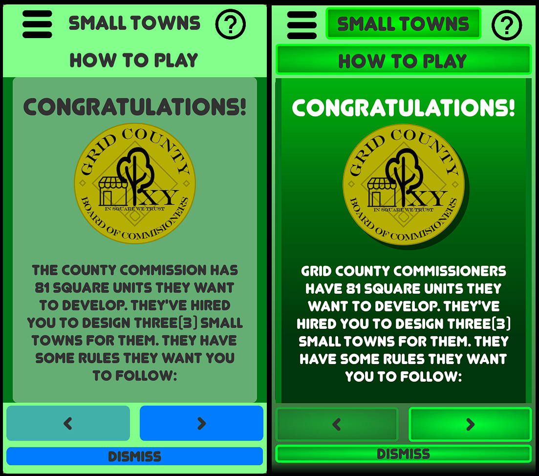
Like most devs, I created the game using pretty bland assets. Simple buttons and backgrounds. No pizazz. Just boring Unity base stuff. Luckily, I have learned a few things about this stuff over the last couple of years. So here we go, take a look at this before and after of the first screen you see in the game:

The before (on the left) is boring, lifeless, and just not inviting. So how do you fix this?
GRADIENTS & SHADOWS
It's a simple thing to import a gradient into Unity. The best way to do it is using grayscale images. They don't even have to be large, 100x100 pixels will do the trick. I used only two different gradients for the background: white to very dark and white to less dark:


The first brings a lot of warmth to the game and Unity simply let's you color these on the fly. I alternate between these two to give some depth to the images.
Secondly the buttons are very flat as well. So I created a simple square with a radiant gradient and a solid white border (I've added a black background for visibility in this post):

unity lets you set "borders" for these types of images so that is stretches correctly. In this case I keep the corners and borders right at the edge of the gradient, and unity does the rest. Add a little color in-game and they really come alive (see above).
Finally, I added the Shadow effect built into Unity to give the logos and tiles a little pop as well. Again, a simple shadow adds some depth and really makes the image pop.
If you're looking to bring your game from dev-art to a more polished look, try these techniques. Heck, you can even use my gradients. I won't charge you.
Get Small Towns
Small Towns
A strategy card game where you build small towns
| Status | Released |
| Author | Sub-Zero Squirrel |
| Genre | Card Game, Puzzle, Strategy |
| Tags | Board Game, Short, Singleplayer |
More posts
- Why the shops score so high, and how to fix it. (Algorithms)Feb 16, 2022
- Achieving Balance in a Card/Board gameFeb 15, 2022
- Small Towns Is Testing My Resolve.Feb 07, 2022
Leave a comment
Log in with itch.io to leave a comment.